
A hands-on cover
I’m not smart enough to tell you why something is well designed… but I can recognize good design when I see it.
Last month’s Golfdom cover was well designed. Pete Seltzer, Golfdom’s art director, hit another home run. It might be the best Golfdom cover of the year so far, and that’s saying something, considering the quality of covers we’ve had all year.
I’m proud of the way the cover evolved, too. Check it out.
Grant Gannon wrote the cover story last month, a feature on online tee time brokers, and how courses seem to have a love/hate relationship with them. We’re happy with the way the story turned out, lots of good sources and advice… hopefully it’s a story you 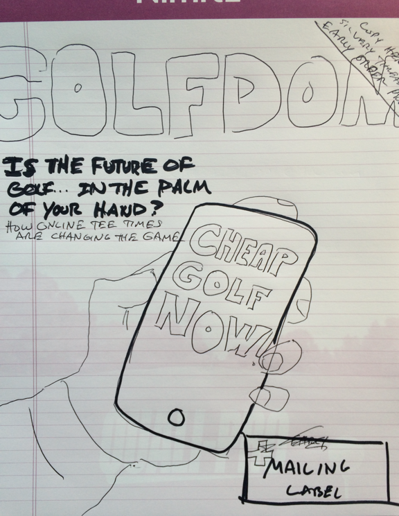 enjoyed as well.
One challenge of the story was trying to create a cover concept suitable for the subject matter.
As you can see, the idea started on a piece of notebook paper I sketched and emailed to Pete. From there, the three of us discussed the idea, and if it would work.
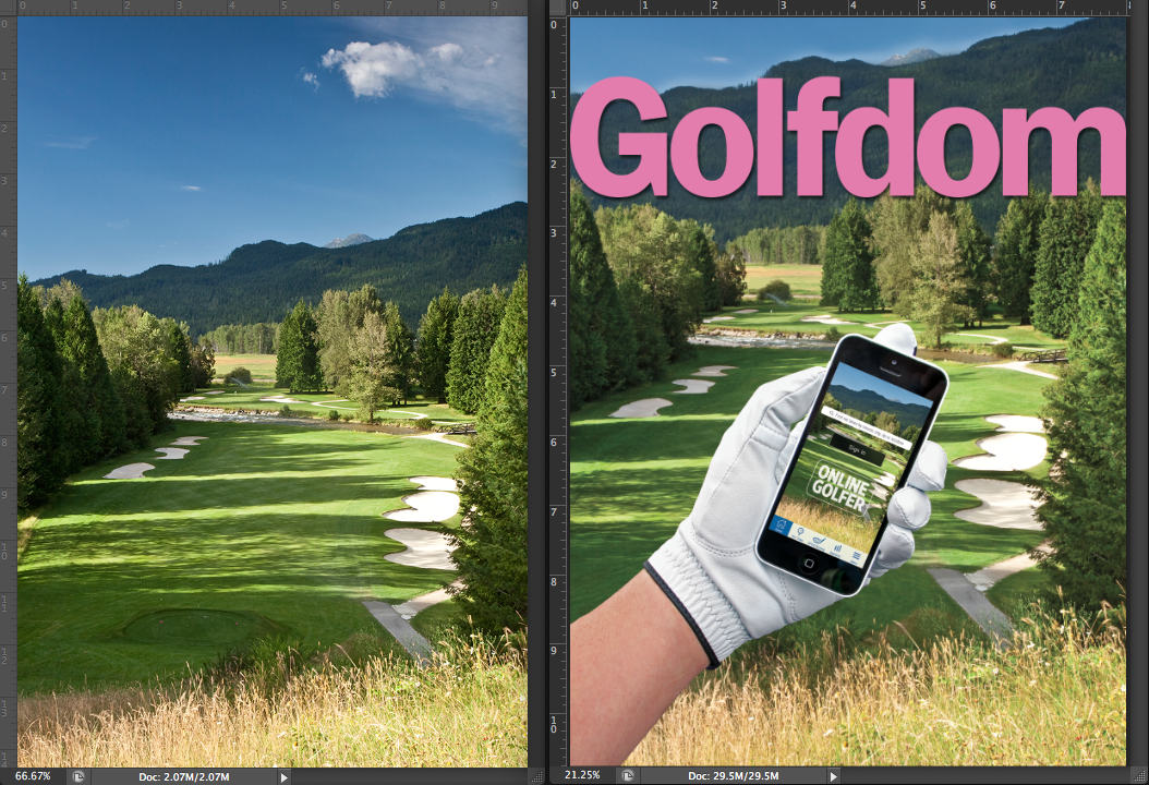
Pete took the ball and ran with it. My favorite add-in to the cover that he did on his own, was the golf course our online golfer is visiting is also the same golf course that appears on the home screen of his phone — that’s so meta.
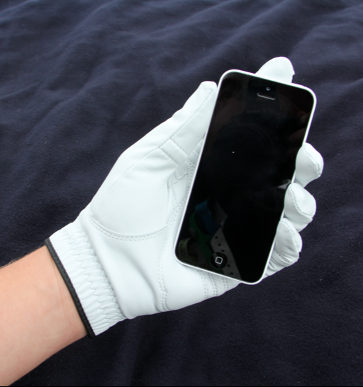 Another thing I enjoyed about the cover is that I had my hand in it, literally. Yes, that’s my gloved hand holding the phone… your pal Jonesy has now dabbled into hand modeling. Hopefully my career isn’t derailed like George Costanza’s was in Seinfeld.
I bought a new glove (Pete’s idea again — I originally shot it with a nasty old glove, but Pete, in his wisdom, said it looked too gross for the cover) and threw that black blanket down for the background. That’s my wife’s iPhone, mine has a giant crack in it.
And then, from that image, Pete went to work, cutting the hand out, laying it on top of this golf beauty shot, creating the home screen and making the whole thing look believable.
Here’s some additional information from the Indomitable Pete Seltzer:
“After selection of the beauty shot, I had to grow the mountain range 500+ feet. This
The Indomitable Pete Seltzer — the man can literally move mountains.
modification created a dark enough background to receive our pink logo for cancer awareness. The dark mountains provide excellent contrast for our logo to really pop!
I’ll spare you the painful details of giving Seth’s arm a proper, digital waxing.”
That last part really made me laugh, Pete… especially because when I showed the cover to my wife and told her, “that’s my hand!” Her response was, “Really? I thought it was a woman’s.”
My wife is well known for trying to keep my ego in check. I said, “Thanks.”
In case you’re wondering what course that is, we’re also wondering the same thing. The image came from iStock, a photo service website, and the only information it shared about the course was that it’s in British Columbia and that those are the Kootenay Rockies in the background. If you know the course, hole, superintendent, etc., shoot us an email so we can give credit where credit’s due.
When we got started, I think we all held our breath on how the  concept would turn out. Looking at the finished product, I can tell you right now it’s one of our best of the year, and we’ll probably submit it to a few contests and see if it wins any hardware. We’re on a good run right now with the Wolf Creek cover (“Friends in High Places,” September) and now this October cover.
What will we bring to the table for November? Stay tuned, but yeah… we want to keep this good streak rolling!
Photos: Golfdom
Subscribe to Golfdom

If you enjoyed this article, subscribe to Golfdom to receive more articles just like it.
