
The icing for the EIC: Celebrating a decade at Golfdom
My three favorite covers
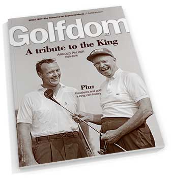
October 2016 cover
October 2016 — A tribute to the King
This is one of the issues I’m most proud of, even though I didn’t write much of it. The sad news that Arnold Palmer had passed came only a few days before we were to go to press. We had a cover story about the long history golf has had with American presidents. In a quick pivot, Pete Seltzer, art director, found this great photo of Mr. Palmer with President Dwight Eisenhower. In another pivot, five of us — Mark Woodward, Joel Jackson, Steve Wright, Karl Danneberger, Ph.D., and myself, all wrote tributes to the King. In a small golf world moment, Joel and Steve retold their stories of when they interviewed with Mr. Palmer — for the same job! As an added bonus, having Eisenhower on the cover was a thrill.
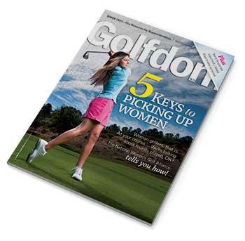
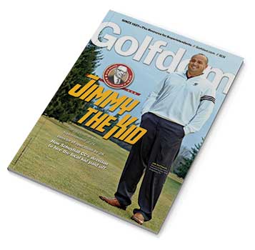
October 2013 cover
October 2013 — 5 keys to picking up women
I remember when this story was submitted, the working title was “Play like a girl!” The story was about how the National Women’s Golf Alliance (NWGA) wanted to help golf courses get better at attracting female golfers with these five key criteria. A spark went off, and I had a new headline. The cover turned heads, won awards and made some folks plenty mad, which is an editor’s version of hitting for the cycle.
I knew we were on the right track when we shared the cover with the NWGA
before going to press to get their take, and the response was, “love it, can we get extra copies?”
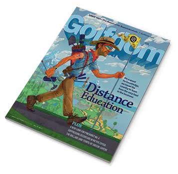
November 2018 cover
November 2018 — Distance Education
In my mind, Golfdom is as cool and slick as any magazine you’d find on the newsstand. For this issue, we swung for the fences and reached out to Andrew
DeGraff, an illustrator whose work you can find in Sports Illustrated and the New York Times. He created this illustration of a superintendent traveling in a quest for knowledge, and it just blew me away. We could feature a golf course beauty shot every month, and that would look great, but it is work like this that I believe makes us stand out.
Three covers I’d like to get back

June 2014 cover
June 2014
You might remember several years ago, we would do an annual three-part series on plant health. Let me tell you, writing about plant health in back-to-back-to-back issues will just about drive a person mad. And, trying to make an interesting cover based on that three-part series? In 2014, we went with this slick-looking image of some grass in test tubes. But then, a researcher called us out for using an image of wheatgrass (I think) on the cover of a golf mag. But, I still think it looks cool.
October 2015
I fondly recall working on this month’s cover story about “online tee time brokers” — which, only five years later, I would simply call “apps.” But how do
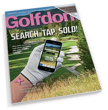
October 2015 cover
you visualize such a story? We came up with this clever package of a hand holding a phone on the first tee of a picturesque mountainside golf course. The cover popped further when we decked out the logo in pink in honor of breast cancer awareness month. A few weeks after the issue came out, I was given a compliment on the cover, the concept and the color scheme … and as an extra touch, using a woman’s hand to hold the phone. The only problem? It was my hand.
February 2014
I enjoyed everything about working on this cover story on the 2014 Herb Graffis Businessperson of the Year Award winner, Jim Rattigan, then superintendent at Schuylkill CC in Orwigsburg, Pa. (Jim is now a Florida-based sales rep for the Plant Food Co. and making big strides in the Florida golf
February 2014 cover
market for the company.) I enjoyed my visit and playing the course with Jim and one of his members. I enjoyed the tour of the oldest brewery in America and meeting the owner, Dick Yuengling of Yuengling beer. I was even put up by one of the members in their guest room and made new friends with him and his family. Being from Kansas, the name Schuylkill was foreign to me, and I was so worried I’d misspell it. The magazine came out, and a few days later I walk into my local bar. The bar owner greets me with, “How was your trip to … Orwigs-BRUG?” Turns out in my fear of misspelling Schuylkill, I instead had a blatant misspelling of Jim’s hometown on the cover. I was horrified. A typo on the cover, the biggest fear of any editor. It still haunts me.
Subscribe to Golfdom

If you enjoyed this article, subscribe to Golfdom to receive more articles just like it.